Salesforce has introduced Lightning Design System which provides built-in styling that allows a developer to focus more on functionality to enhance the developing experience. By using it, when we develop apps in salesforce, the apps are feasible with lightning experience. The focus now is to understand Grid In Lightning Design System.
Create a customized scoped CSS file to use
Before acknowledging grid in lightning design system, it is mandatory to create a customized scoped CSS file to get access of the helper classes which are predefined. Following steps are required for the same-
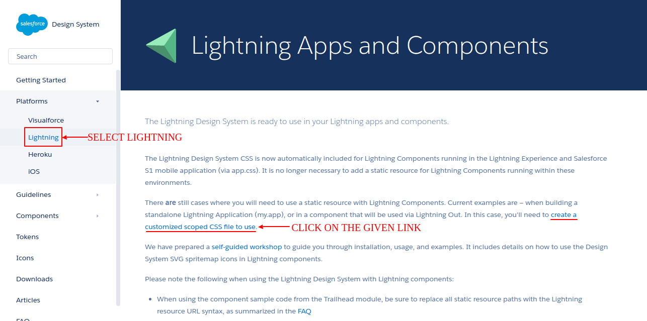
Step 1: Go to the link https://www.lightningdesignsystem.com/
Step 2: Click Platform>lightning.
Step 3: Generate a scoping class. You have to use the name of the class you have just mentioned, further in the code.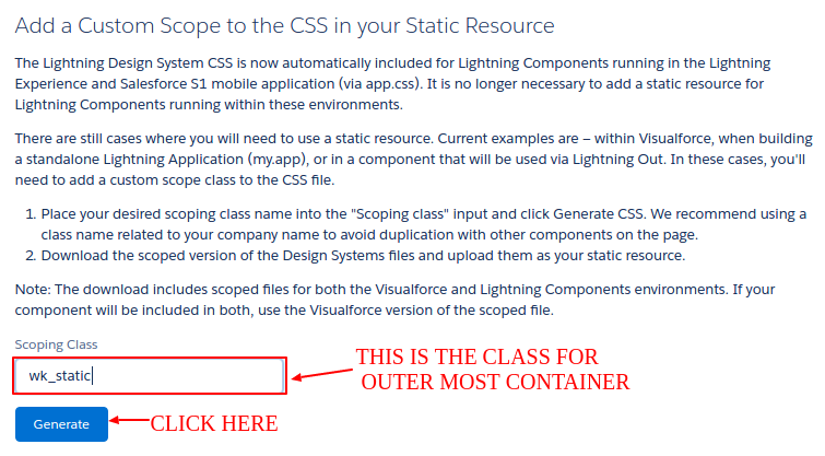
Step 4: Download the zip file.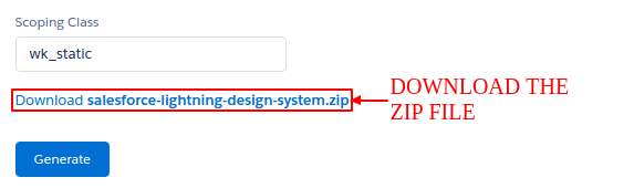
Step 5: Include it as static resource.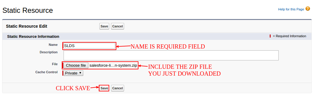
Or else,
You can download the attachment given here and add it as static resource.
salesforce-lightning-design-system
Now whenever you need to use the static resource. Use the following Nutshell:
<apex:page showHeader="false" standardStylesheets="false" sidebar="false" applyHtmlTag="false" applyBodyTag="false" docType="html-5.0">

        <!--
        /**
         * Webkul Software.
         *
         * @category  Webkul
         * @author    Webkul
         * @copyright Copyright (c) 2010-2016 Webkul Software Private Limited (https://webkul.com)
         * @license   https://store.webkul.com/license.html
         */
         -->

	<html xmlns="http://www.w3.org/2000/svg" xmlns:xlink="http://www.w3.org/1999/xlink" lang="en">
	    <head>
		    <meta charset="utf-8" />
		    <title>Lightning Design System</title>
		    <meta http-equiv="x-ua-compatible" content="ie=edge" />
		    <meta name="viewport" content="width=device-width, initial-scale=1" />
		    <apex:stylesheet value="{!URLFOR($Resource.SLDS, 'assets/styles/salesforce-lightning-design-system-vf.min.css')}"/><!--Include the stylesheet-->
	    </head>
	    <body class="wk_static"><!--Always write the name of your scoping class in the outermost div-->
	    </body>
    </html>
</apex:page>
Grid
Code:
<apex:page showHeader="false" standardStylesheets="false" sidebar="false" applyHtmlTag="false" applyBodyTag="false" docType="html-5.0">
<!--
/**
* Webkul Software.
*
* @category Webkul
* @author Webkul
* @copyright Copyright (c) 2010-2016 Webkul Software Private Limited (https://webkul.com)
* @license https://store.webkul.com/license.html
*/
-->
<html xmlns="http://www.w3.org/2000/svg" xmlns:xlink="http://www.w3.org/1999/xlink" lang="en">
<head>
<meta charset="utf-8" />
<title>Lightning Design Grid System </title>
<meta http-equiv="x-ua-compatible" content="ie=edge" />
<meta name="viewport" content="width=device-width, initial-scale=1" />
<apex:stylesheet value="{!URLFOR($Resource.SLDS, 'assets/styles/salesforce-lightning-design-system-vf.min.css')}" />
</head>
<body>
<div class="wk_static">
<div class="slds-grid"><!-- Automatic Sizing -->
<div class="slds-col">
<div class="slds-box slds-box--small slds-theme--shade slds-text-align--center">col</div>
</div>
<div class="slds-col">
<div class="slds-box slds-box--small slds-theme--shade slds-text-align--center">col</div>
</div>
</div>
<div class="slds-grid slds-grid--pull-padded" style="margin-top:2rem;">
<div class="slds-col--padded">
<div class="slds-box slds-box--small slds-theme--shade slds-text-align--center">col--padded</div>
</div>
<div class="slds-col--padded">
<div class="slds-box slds-box--small slds-theme--shade slds-text-align--center">col--padded</div>
</div>
</div>
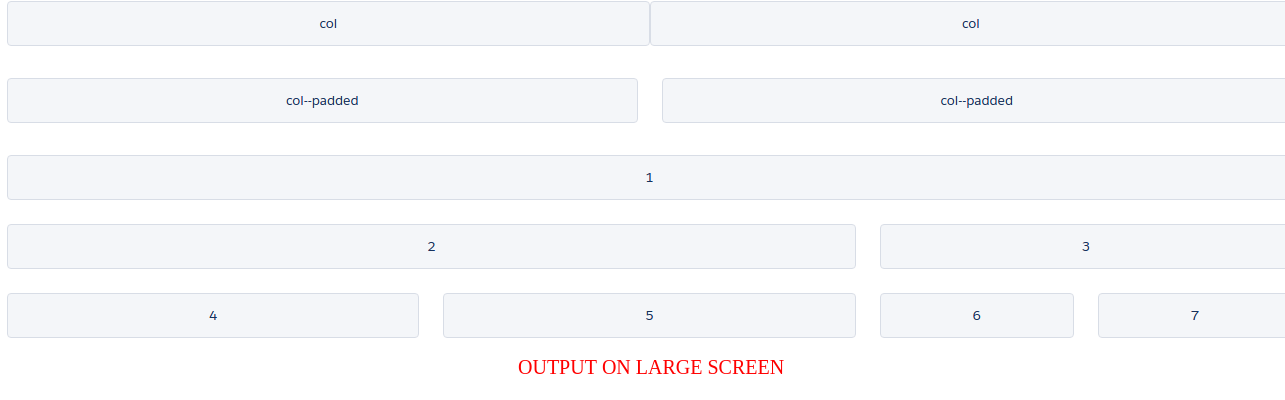
<div class="slds-grid slds-wrap slds-grid--pull-padded" style="margin-top:2rem;"><!-- Manual Sizing -->
<!--This div will be of whole width on any screen-->
<div class="slds-col--padded slds-size--1-of-1 slds-p-bottom--large">
<div class="slds-box slds-box--small slds-theme--shade slds-text-align--center">1</div>
</div>
<!--This div will be of 1/2 width on small, 5/6 width on medium and 8/12 width on large screen-->
<div class="slds-col--padded slds-size--1-of-2 slds-medium-size--5-of-6 slds-large-size--8-of-12 slds-p-bottom--large">
<div class="slds-box slds-box--small slds-theme--shade slds-text-align--center">2</div>
</div>
<!--This div will be of 1/2 width on small, 1/6 width on medium and 4/12 width on large screen-->
<div class="slds-col--padded slds-size--1-of-2 slds-medium-size--1-of-6 slds-large-size--4-of-12 slds-p-bottom--large">
<div class="slds-box slds-box--small slds-theme--shade slds-text-align--center">3</div>
</div>
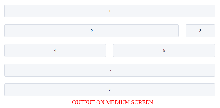
<!--This div will be of whole width on small, 1/2 width on medium and 1/3 width on large screen-->
<div class="slds-col--padded slds-size--1-of-1 slds-medium-size--1-of-2 slds-large-size--1-of-3 slds-p-bottom--large">
<div class="slds-box slds-box--small slds-theme--shade slds-text-align--center">4</div>
</div>
<!--This div will be of whole width on small, 1/2 width on medium and 1/3 width on large screen-->
<div class="slds-col--padded slds-size--1-of-1 slds-medium-size--1-of-2 slds-large-size--1-of-3 slds-p-bottom--large">
<div class="slds-box slds-box--small slds-theme--shade slds-text-align--center">5</div>
</div>
<!--This div will be of whole width on small and 1/3 width on large screen-->
<div class="slds-col--padded slds-size--1-of-1 slds-large-size--1-of-3">
<div class="slds-grid slds-wrap slds-grid--pull-padded">
<!--This div will be of 1/2 width on small, whole width on medium and 1/2 width on large screen of parent div-->
<div class="slds-col--padded slds-size--1-of-2 slds-medium-size--1-of-1 slds-large-size--1-of-2 slds-p-bottom--large">
<div class="slds-box slds-box--small slds-theme--shade slds-text-align--center">6</div>
</div>
<!--This div will be of 1/2 width on small, whole width on medium and 1/2 width on large screen of parent div-->
<div class="slds-col--padded slds-size--1-of-2 slds-medium-size--1-of-1 slds-large-size--1-of-2 slds-p-bottom--large">
<div class="slds-box slds-box--small slds-theme--shade slds-text-align--center">7</div>
</div>
</div>
</div>
</div>
</div>
</body>
</html>
</apex:page>
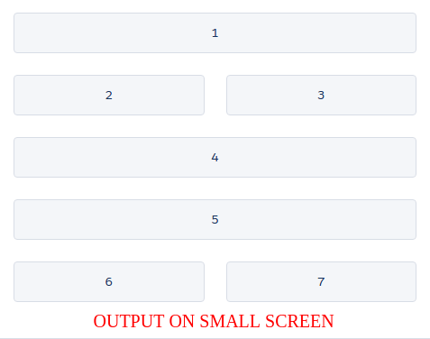
Output:
Support
That’s all for Grid In Lightning Design System, still have any issue feel free to add a ticket and let us know your views to make the code better https://webkul.uvdesk.com/en/customer/create-ticket/
Read More: Navigating SObjects for Lightning Experience Users


Leave a Comment
Comments (0)